Taking Flight

My intentions after coming back from the New York watercolor show and after completing my big commission were to spend the summer creating many new paintings for the upcoming studio tour and make some blog posts.  But…the universe had other plans for me.  Just as Spring was ending I broke my wrist, which made my summer plans nearly impossible. I had to give priority to healing if I was ever to paint again.  Now that I am on the road to recovery (but not quite up to painting) it’s a little easier to type, so I decided to share my inspiration for my paintings with you.

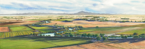
I have always loved the beautiful patchwork of the quilted farmlands and delta area of the Sacramento, California area.  The meandering river across the agriculture and the velvety rice fields as seen from the air are amazing.  I started painting this view to capture the feelings it evokes for me; a natural beauty that is fragile and ever changing depending on drought, season, time of day and human influences.  I sought out small aircraft pilots to take me up so I could gather photos to paint from.  I’ve had some wonderful experiences and met some interesting people.  Taking flight is almost more fun than creating the actual painting!  I have had some memorable flights in some historical planes including a  1940’s Piper Cub.

Piper Cub

Piper Cub


Aeronca Champ

Aeronca Champ

Recently I flew in an Aeronca Champ, which was a WWII training plane, owned by a family of pilots.  It was originally purchased to commemorate a family member’s 60th birthday who had flown the same kind of plane in WWII.   I heard some wonderful stories and family history as I flew with the pilot, and felt honored to be a passenger.  I learned that during the war the tandem passenger seat behind the pilot was often removed so that an injured soldier could be slipped feet first into the tail and transported to safety.  To think that this very plane may have saved a brave soldier was very humbling.

RadioTV tower

The tops of those radio towers were fascinating to see from that perspective!

We left out of a tiny private airport on the Sacramento delta late in the day so that I could get the long shadows that add some drama to my aerial paintings.  My task was to get some good photos to use for a large commission I was starting.  The challenge was that the ranch I needed to photograph was below five tall radio/TV towers.  We needed to carefully fly around the towers and their many wire cables.  I was also trying to include the river, small town of Walnut Grove and the iconic landmark, Mt. Diablo.  I had to put my trust in the pilot that he would get us back safely and just enjoy the ride.

Town of Walnut Grove

Walnut Grove, CA

We flew over the Sacramento River, the towns of Walnut Grove, Locke and Isleton, farmlands, pear orchards, marinas, bridges, dairy farms, wildlife preserves and breached levees.  The vegetation was beautiful and varied.  There were rows of trees and crops, manicured homes, gardens, fields, wild delta areas with patterned islands of cattails and marshlands.  There were labyrinths of man made duck hunting ponds and sloughs choked with beautiful water hyacinth.  There was a lone boat gliding past a string of tiny delta islands shaped like teardrops floating like gems on a necklace.  All the while Mt. Diablo was watching us.  It’s no wonder pilots love to fly over the delta – the view is breathtaking!

Oxbow Marina (2)

Oxbow Marina, Isleton

One of the many memorable sights was the Oxbow Marina in Isleton.  It is a big loop on the river where there is a marina of boats and a resort.

Pear pool

Pear shaped pool

Nearby was a home with a pear shaped pool!  The steps into the pool was the stem of the pear.  It was obviously owned by a pear farmer.

Bridge to Nowhere

Bridge to Nowhere

A surprising sight was the “Bridge to Nowhere” where long ago the levees were breeched. The land was allowed to be reclaimed by the river and is filling in with marshland making beautiful colored circles of vegetation in various sizes.  The bridge once led to other farms, but now it’s a dead end to the water if one attempts to cross.

Sacramento River

Sacramento Delta

Bridge on Steamboat Slough

Bridge on Steamboat Slough

I captured some great photos from that flight, which allowed me to complete my commission (shared in an upcoming post).  My painting that was accepted into the American Watercolor Society Exhibition was from the same flight.  If you look carefully in the lower right corner of that painting you can see the little airport I flew out of.  The painting, “Diablo’s Delta” is currently touring the US for the next year in the AWS Traveling Exhibition.  View my “Upcoming Shows” to see if it’s coming to a city near you.

Many thanks to my winged friends who share their passion with me and let me take flight with them so that I can share my passion with you!

Note – all photos are copyrighted by the artist and may not be used without permission.

Third Time is a Charm!

bowers_elaine

This is my painting that I entered into the American Watercolor Society‘s 149th Annual International Exhibition. To my delight it was accepted, and because it is my third time, it means I will receive the coveted Signature Status, allowing me to add “AWS” after my signature on my watercolor paintings. A signature status means that an artist has met the required standards of an art organization signifying a high skill level and achievement in a specific medium. The American Watercolor Society (AWS) is the oldest watercolor organization in the US and had their first annual exhibition in 1867. A few past distinguished members are Winslow Homer, Louis Comfort Tiffany, Edward Hopper, William Merrit Chase, Thomas Eakins, Samuel Colman, Charles Burchfield, Gladys Rockmore Davis, Childe Hassam, John LaFarge, Alphonse Mucha, Edward Potthast, Mahonri Young and Andrew Wyeth. I feel honored to be accepted as a signature member and follow in their footsteps!

A few years ago I earned the signature status in the National Watercolor Society (NWS), which is only half as old as the AWS. It has a similar requirement/process. I was just as excited at that time because for both shows I had been rejected for many years and I was ready to give up entering. My persistence paid off! So now I have the status for both of the largest US watercolor organizations. For the American Watercolor Society, the criterion is to get accepted into the annual International Exhibition three times. This is a very difficult accomplishment since getting in just once is a challenge! Each competition has 1200-1600 entries from around the world. The artist may only submit one image for review, there is an entry fee and entries are submitted digitally. The entries are viewed independently by 5-6 jurors, who must all concur (without discussion). Approximately 140 – 150 paintings are selected to be in the exhibit, so jurors must continue viewing the entries until they select the designated number of paintings. The original art is then shipped, at the artists cost, to the show in New York. Then the art is reviewed in person by an awards jury, who are three different jurors from the selection jury. Any artist qualifying for the signature status is judged separately and must submit two paintings to be juried.

The entire process is quite extensive. As I commented in a previous post, jurors must be exhausted after reviewing art because if they view each image for 30 seconds that would be about 12 hours for the first round of screening. It gives one a better understanding of why it is so important to submit a good photo of your art and the painting needs to be exceptional. An image only has a few seconds to catch the juror’s attention, so it needs to stand out. There are also size requirements and media limitations to be mindful of (no collage or non-water based medium). Also, entries must be from an original source, painted in the past 2 years and not shown in another national or international competition.

The accepted painting, “Diablo’s Delta,” is from a flight I took with a local pilot.  Look closely at the lower right corner, far side of the river and you will see the hangar and little air field we flew out of. We flew late in the day over the Sacramento Delta and you can see Mt. Diablo in the background. It was an amazing flight in a very special plane. I will add more about the flight and plane in a later post.

If you are in New York City be sure to see this great show. You won’t be disappointed! It’s at the Salmagundi Club, 47 Fifth Ave., NY, NY 10003 from April 4-23, 2016. Selected paintings will then travel around the country to about 8 cities in the next year. Catch the 2015 traveling exhibit at its last stop here in Sacramento, CA. It is at the Sacramento Fine Art Center through April 9, open daily 10-4. The location is 5330-B Gibbons Dr., Carmichel, CA 95608.

Pillows – A perfect showcase for art

For my last gallery show I was searching for a secondary market item for my art. I like to offer a few ways that patrons can purchase my art. I have printed note cards for a long time, but the profit margin is minimal and writing cards is “old school”. Few people send hand written cards any more and many gift shops won’t carry blank note cards because they no longer have a market for them. I also offer signed limited edition Gicleé prints of my art, but I like to have another price point that is affordable to patrons who want an image of my art. Also, some patrons just don’t have any more wall space. So I decided to try pillows.

IMG_7009

My idea was to print several art images on pillows through an online site. I found a site that offered the product I wanted in several sizes. So I ordered a few test pillows. I also had some nice cardboard tags made with some info about myself and my art. I attached each tag with twine using a small brass safety pin. Finally I hand signed each pillow in gold acrylic paint on the back to make them extra special. I offered them through the gallery at my last show and at my studio tour. They were a hit and flew out of the gallery! I sold a lot at my studio tour too. Patrons found them fun, different and affordable. I plan to continue printing a selection of images for each show.

Here are a few tips if you plan to try it with your art:

  • Do a test sample first to make sure the product is what you want.
  • You will need a very high quality photo so that the pillow image looks good. I only had one side printed and the back was a plain matching color. I kept the backing the same color on all my pillows for continuity.
  • I added my signature to my pillows with metallic acrylic paint.  I tested lots of fabric paint and markers, but didn’t find any that were truly metallic or opaque. I finally found Golden  Irridescent Copper Light (fine) acrylic paint to be the best to use for my signature. It is #2452-1/Series 7.
  • Once you make an order online most sites offer specials so you will use them again, so wait for discounts and coupons to place larger orders. I found that Cyber Monday (after Thanksgiving) offers good discounts, some sites up to 60%.
  • Some sites have a free shipping plan if you sign up and pay a one time fee. It’s worth it if you plan to make a lot of orders.
  • Many sites will offer additional discounts if you rate your order satisfaction. Take advantage of this.
  • Some sites allow you to post your image publicly in your own store or collection so others can buy the product and you get a commission. The site takes care of the order and shipping.
  • Make some nice tags to make the pillows retail ready and suitable as gifts.  I included a photo and some info about my self with my website info.

2016-02-13 14.31.18_resized

cropped signature

Signature in metallic paint


Be aware that even with a test order quality control isn’t always consistent. I started with Zazzle, but found their quality control very poor. In several orders, half of my pillows came with the zippers sewn in upside down or on the side. They had to be sent back and reordered. It was a hassle to send them all back and they said they couldn’t guarentee that the zipper would be on a particular side (bottom).  I missed a few shows/sales because of this issue. Also, they sewed some seam allowances crooked, showing the white edges. Other pillows were returned because the print was washed out or the fabric was inferior. I did order my tags from them and was very satisfied with those.

2016-02-13 20.13.54

Gift tags

Due to the above reasons I am searching for another source, but plan to continue marketing this product. The other source I found is Spoonflower. They offer over 16 different fabric choices. You can upload your image and have fabric, wallpaper or wrapping paper printed. Its possible to have a repetitive pattern with your images or to make a mirror kaleidoscope image. This is really fantastic if your work is more abstract. The site program lets you try it out and you can have a 5″ X 5″ sample printed. You can also scale the image down so it repeats in a smaller pattern or do a brick/alternating pattern. You are given a 10% discount when you order your own fabric designs. There seems to be better quality control and more options, but the downside is you would either need to make the pillows yourself or find someone to do that for you. (I’d rather be painting than sewing pillows!)  Spoonflower also offers fabric that would be perfect for scarves. Abstract art would be beautiful as a scarf!  I know an artist that does this and they are very unique.

I recently discovered another site – Society6. There are many other sites out there, but I caution you to do a test run and only choose one or two items so that you don’t over market or devalue your original art.  There are many other product options besides pillows and scarves. There are skateboards, phone covers, serving trays, bedspreads, blankets, playing cards, T-shirts, and more!

So have fun and try a secondary art market!  Let me know how it works out or share the sites and products that have worked for you.

Painting the Deckle Edge

“Delta Sunrise” is inspired from a photo I took while flying over the Sacramento River in a 1940’s Piper Cub.  It was an amazing ride, as the pilot had the window open so I could hang out and get photos.  We were so low it felt as though I could almost touch the tree tops!  The passenger sits in front with the instruments, while the pilot sits in back.  It was an odd feeling that left me wondering who was flying the plane.  We took off and then landed in a bumpy field.  I took over 500 photos to paint from and the trip has been my most memorable flight yet.  Many of my recent aerial paintings have been from those photos.
Step 1

You can see that I started with a wash in the river and the sky.  While the sky is still wet I dab tissue to pick up the paint and create the clouds.  Since I don’t stretch my paper and I like to paint to the deckled edge, it is very difficult to do a wash in the sky and river.  I have to be careful not to rest the edge of the paper on the table or it will cause a bloom or backwash where the paper dries at a different rate.  In this painting I had a very difficult time because half the paper was wet and flimsy around the lower three edges.  Typically I pick up the paper and manipulate the wash by moving it around in different directions and upside down, but that was impossible with half the paper dripping wet and flopping!  I hadn’t planned ahead and almost lost the painting because there was no where to hold it as the washes blended and dried.  The lesson learned was to tape my paper on the underside to a piece of foam core board just smaller than my paper, but with an area that I can hold so that the paper can be manipulated while wet.  I also learned to use some small wooden blocks to set under the edges of the paper as it dried to hold it away from the table.

Step 2

I started adding the landscape washes and building up the layers.  I still wasn’t sure if I wanted another wash on the water, so I waited until there were more washes and details in place.

Step 3

I added in more details and started painting the reflections.

Delta Sunrise

In the completed painting you can see where the shadows and reflections really bring out the depth of the painting and ground the viewer.  I love placing the shadows last as the finishing touch.  I was happy that I kept the lower half of the painting all water without the river bank, as I think it really draws the viewer in and gives the feeling I had while I was flying.  I hope it conveys this to the viewer.

“Delta Sunrise” is my painting that was selected for the 148th American Watercolor Society International Exhibition in New York and will be showing at the Salmagundi Club in April.  There are over 1600 entries every year from around the world and only about 150 are chosen by the jury, which consists of five judges that must concur on the selections.  Entries are submitted digitally and each artist is only allowed one entry.  It’s a rigorous process that doesn’t allow the judges to discuss the entries until after the selections have been chosen.  They continue to go through the entries until all the judges concur on the total paintings needed.  After the selection, entries are then shipped to AWS and judged for awards by three additional jurors.  I have entered this competition numerous times and have lost count of the number of times I’ve been rejected.  Then in 2013 I was thrilled to get a call that not only was I accepted, but I won a top award!  It was very exciting!  I kept expecting to get another call saying it was all a mistake!  So imagine my excitement when I was notified that I was selected to be in the show this year.  No award, but getting into this prestigious show again is a thrill!  I hope if you are in New York in April you will stop in to see this amazing watercolor show.  It will then travel around the US to several cities in the next year.

Art Competitions – Developing a Thick Skin

Elaine and juror Gregory Kondos

Elaine and juror Gregory Kondos

I was honored last weekend to actually meet acclaimed landscape artist Gregory Kondos at the Crocker-Kingsley Art Exhibition. I was especially honored because he chose my watercolor “Cottonwood Bend” as one of 75 pieces accepted out of 1600 entries of mixed media to be in this year’s show. The competition, which is held every two years, is open to California artists and it’s a very difficult show to get juried into. I have been rejected numerous times – too many to count! In fact, I gave up entering because it seemed out of my reach. Each time that I was rejected and then went to the show, I came away disappointed, as it seemed the art selected had little rhyme or reason. There were some great pieces, but many others left me dumbstruck. My traditional representational landscapes just weren’t making the cut! One year I remember being so frustrated that I vowed never to enter again! One of the pieces accepted that year was a cube of about 25 stacked square Tupperware containers with lids. Each container had a dead leaf in it… that’s it! This was only one example among many other similar pieces that were also accepted. I do like contemporary art, but I never did understand the meaning or creativity behind that Tupperware piece. It left me feeling defeated since it had been accepted over one of my watercolors.

I’ve since entered many other art competitions and slowly came to understand the jury process better. Not only does an artist need a thick skin to enter competitions, but we need to be able to accept rejection gracefully. Just because our piece wasn’t chosen for a juried competition doesn’t mean it was bad. Typically, good competitions get numerous entries (often thousands) and there is limited space, depending on the exhibition space. Now, imagine if every one of those entries were all by famous artists. If there is only room for 40 pieces, then many would need to be rejected, but it doesn’t mean their work was terrible or they weren’t skilled!

imageAnother point to ponder is, if the show gets 1600 entries, then an artist’s work needs to catch the juror’s attention within seconds. If the juror looks at each entry for just 30 seconds, that is about 120 images per hour. To look at 1600 images would take about 13.33 hours. That is a lot of time for a juror to be viewing art, let alone choose 75 from that group to be in a show. I would expect a juror feels pretty burned out as she gets to the last few! It’s also the reason why submitting a good photo of the art is really important. If it’s not a good representation, then it will surely get rejected. Additionally, some competitions have several jurors that have to concur on the art selected, which is a huge process.

The other thing I’ve learned is an artist should enter a show that you like and one that is suited for your work and skill level. Be sure to consider if the competition is multi media versus one medium; contemporary versus traditional; local, national, or international; and is it more for established artists or emerging artists? Multi media shows may have the artist competing against 3D art and photography. I learned that certain shows accept more contemporary pieces and are less likely to accept a traditional painting. International shows will draw more entries than local shows. Also, if you enter a show above your skill level you will be sadly disappointed. The same goes for entering a show that an artist has advanced beyond. Be sure to compete against your peers at the same level of skill.

Also, look at the juror – that is crucial. If Jackson Pollock were a juror, I’m guessing he wouldn’t choose many (or any) traditional paintings. So this year, when I saw that Gregory Kondos was the juror for the Crocker-Kingsley show I decided to try one more time. Although he is an impressionist, I knew he was a renowned landscape painter and he loves the Sacramento Delta. I also admire his work. So if I wanted to try again, this was the year to enter. I was thrilled to get into the show! I didn’t win an award, but getting into the show was an award in itself after so many years of trying.

So how does one approach such an acclaimed artist as Gregory Kondos? Well, at the reception during the awards it was announced that Mr. Kondos had actually been rejected 13 times before being accepted into this show. That’s 26 years of rejection and persistence… and now he was a juror! That both humbled and inspired me! So I took the opportunity to approach him with a big smile and said, “I think I may have beat your rejection record!” He took my hand and kindly said, “You weren’t rejected, you just weren’t selected.” Now that’s a great quote from a great artist, and words of wisdom for us aspiring artists to remember. He was gracious enough to sign my show catalog and take a photo with me (even better than an award!). It was an end to a great evening and gave me even more respect for one of my favorite California artists!

Click this link to see my watercolor painting “Cottonwood Bend. ” It will be on exhibit at Blue Line Arts, in Roseville, CA through Feb. 21, 2015. If you missed the opening reception, there will be a closing reception on Sat. Feb. 21 from 7-9 PM.  I will show the painting in progress and share about how I created it in a future post.

Back to blogging after painting like crazy!

"Birdseye View" Show

“Birdseye View” Show

Many of you may be wondering what happened to my blog posts.  Well… my website server changed the offerings and no longer hosts the blog feature.  So I had to change things up and learn a new system.  I have a big learning curve, so hang in there with me!  After all, I’m not a writer or tech person, I’m an artist.   What I do best is paint, but I’m learning how to use this social media!  I still don’t do Facebook, so this is the best place to see the lateset work I’ve been doing and where my inspirations come from.

I was also getting ready for a huge gallery show and had a large quota of paintings to do.  Since my bigger watercolor paintings take a minimum of 3-4 weeks, I had a lot to do in order to be ready to hang the show by my deadline at the beginning of this past September.  Hopefully many of you were able to see my show “Birdseye View” at the Gallery at 48 Natoma (see photo).  If not, you can visit my website and go to “recent works” to see most of my paintings that were in the show.  You are also in luck, as I will be showing many of them in an upcoming show in June 2015 at “The Tong Gallery” in Walnut Grove, California.  I hope to have some additional paintings to show of the Sacramento Delta.

After the holidays I will do my best to post again on a regular basis .  I have lots of things to share with you about some recent travels and inspirations.  I’ve also documented the creative process of many of my recent paintings, so I will post photos of the work in progress soon.

If you have ideas that you would like me to share and post about, please let me know at butterflystudios@surewest.net.  Also, if you want to follow my posts, please sign up by clicking the “follow” button.

Note: If you signed up to follow my blog prior to November 2014, you will need to do so again since I am with a new server.


Rice Fields a Flowing…


I have been listening to Christmas music as I paint and the Twelve Days of Christmas tune is stuck in my mind!  Due to the holidays almost upon us, I have failed to find time to make any blog posts.  I have been busy decorating, baking, shopping, wrapping packages, sending cards and painting. I’ve been trying to stay focused on my upcoming show in the Fall so that I will have the required number of paintings.   Surprisingly I have managed to finish a few pieces. 

The painting above is of the beautiful rice fields here in the area.  I absolutely love the undulating rice fields from the air.  The contours follow the topography of the land, although it is becoming increasingly difficult to find these types of rice fields.  I have learned that the farmers have a more efficient technology now for leveling the fields, which uses special laser equipment.  This allows for straight fields, which make it easier to flood and produces a higher crop yield.  Artistically speaking they are not as beautiful to me.  I love the curves of the levees and the colors of the water and rice plants.  Sometimes the flooded fields reflect the sky and clouds, and during the growing season they look like lime green velvet.  When the fields are harvested there is a beautiful geometric pattern left behind in the fields.  Frequently there are a variety of birds feeding in the flooded fields, including the white Egrets.  Watercolors are perfect for painting the rice fields.  I especially love to let the paint flow and make wonderful swirls, blooms, bleeds and blending.  It allows for the happy accidents in watercolor and the use of artistic license, but nature and the farmers are really the artists.

In this painting, which I titled “Meandering Moments,” you can see in the last photo how I masked out the levees so that I could lay down the washes in the fields.  Then I removed the masking in the middle photo and painted in the levees.  The finished painting has lots of watercolor surprises, as the washes blended and dried.  It is quite a colorful and lively painting.  I enjoy the abstract quality, even though it is fairly representational.  The rice fields are so beautiful!

So if you are interested in getting a preview of this painting, it will be in a watercolor show at the SMUD Gallery from Jan. 23 – Mar. 19, 2014.  The address is the SMUD building at 6301 S St., Sacramento, CA  95817.  There will be a reception the first day.  Hours for the gallery are M – F 8AM – 6PM.  The painting is a peek at what I am working on for the show next Fall.

If you would like to learn more about the California rice fields and agriculture go to the California Rice Commissions website at www.calrice.org.  

Happy Holidays!

(Note – My blog will be through a different source in Jan. so there may be a few changes.)

Masking fluid and progress on the lighthouse


Here are photos showing progress on one of the paintings I’ve been working on for my upcoming show in September 2014.  It is the aerial view of the Pt. Arena Lighthouse (see previously posted photos from my flight).  I was excited to work on this painting since it has such a fantastic view of the point and the lighthouse. 


After sketching the drawing I carefully used masking fluid to block out the rocks.  This is done when an artist needs to save the white of the paper and not have to worry about getting paint in those areas.  It would be very time consuming to paint around each rock and nearly impossible to keep a nice flowing wash in the ocean area without masking other areas first.  This allows me to wet the ocean area and keep it wet while I add different shades of blue and dark shadows.  Sometimes it takes several layers of washes. 


After the area is dry and I know I don’t need the masking any more, then it is pulled/rubbed off the paper.  It’s a bit like rubber cement, but is more fluid when wet.  It can be tricky to work with because it can ruin brushes and it can leave shadows or stains behind.   Also, if it’s left on the paper too long it won’t come out.  I learned that the hard way when I ruined a painting after several months and had to start over again.  But that’s another story (and another post)!   I use the masking fluid from Daniel Smith that comes in a little squeeze bottle and has a tiny tip on it.  They also have a great tip list on their site.


Next I masked out the buildings, road and trees.  Then I applied the washes for the ground.   I also applied just a bit of table salt while the wash was wet to give some textured ‘blooms’  that will suggest small rocks.  These first areas were the easy parts of the painting.  Now I started the details of the cliffs and rocks, but I decided I wanted to see what the buildings would look like.  Sometimes I get impatient to see what the painting looks like, so this gives me some satisfaction and I can now play off some of the colors in the buildings by also using them in the rocks and cliffs.  I can always come back to add or change things as I go.  The painting definitely changed once I got those details in.


Once I finish the rocks and cliffs then I will go back to the ocean and include some detail in waves and water ripples with tiny washes.  I saved some white of the paper for frothy waves, but I can always add little spots of white gouache if I need more white accents.  This painting will need a title when it’s done if anyone has some ideas!


Discover the Tong Gallery

Art exhibit of Elaine Bowers aerial landscapes


The Tong Fine Art Gallery


14136 River Road

Walnut Grove, CA  95690

(916) 240-6097


Fri.-Sun.  11AM – 4PM

May – Dec. 15


I have recently discovered the Tong Fine Art Gallery in Walnut Grove, CA.  Since it features Delta art I was invited to show my aerial landscape images in the gallery.  It is located on the main river road near the bridge in the historic Tong building, which is where the Chinese Masons met.  It is a unique gallery which has a variety of fine arts and jewelry made by local artists.  The building has all the historical elements including the old kitchen, which is currently being used to display items that are for sale.    The cultural essence of the building is also reflected by the furniture and many old Chinese artifacts.  It’s definitely worth a weekend visit and is only 35 min. south of Sacramento.  While down that way stop for brunch at the Grand Island Mansion. We’re having the perfect Fall weather to make a day of it! 


Note – As of December 15, 2013 The Tong Gallery has closed for the season and will reopen in May 2014.


A Watercolor Artist’s Dream!

Wispy clouds with drift wood shelter  Wispy clouds


I was recently at Sea Ranch in Gualala, CA and the weather was absolutely beautiful!  The clouds were very wispy and definitely an inspiration for a watercolor artist!  I couldn’t wait to get back to my studio so that I could start painting!  The photo on the left is at Gualala Point where many visitors brave the wind and use the driftwood to make wonderful sculptural shelters.


Since the weather was so beautiful, I decided to try getting a pilot from the area to take me up so I could take some aerial photos to paint from.  I was in luck and found a member of the Sea Ranch Flying Society who was more than happy to take me up.  His plane is a Light Sport with a large glass canopy, so it was perfect to see the views below (see photos).  We flew North up the coast, over Sea Ranch, Gualala, Pt. Arena and the Pt. Arena Lighthouse.  It was wonderful to be up there  taking in all the beauty of the California Coast.  We even saw several sheep grazing, which I later found out were actually white cows (after checking my photos)!   I was disappointed because Sea Ranch used to be a sheep ranch, so I really wanted some photos of sheep!  I can’t wait to paint all the wonderful scenes I saw.   I’m just not sure which views to paint first!


Aerial view of lighthouse     Aerial view of Sea Ranch, Gualala, CA

                                  Light Sport Plane